Otto Bock
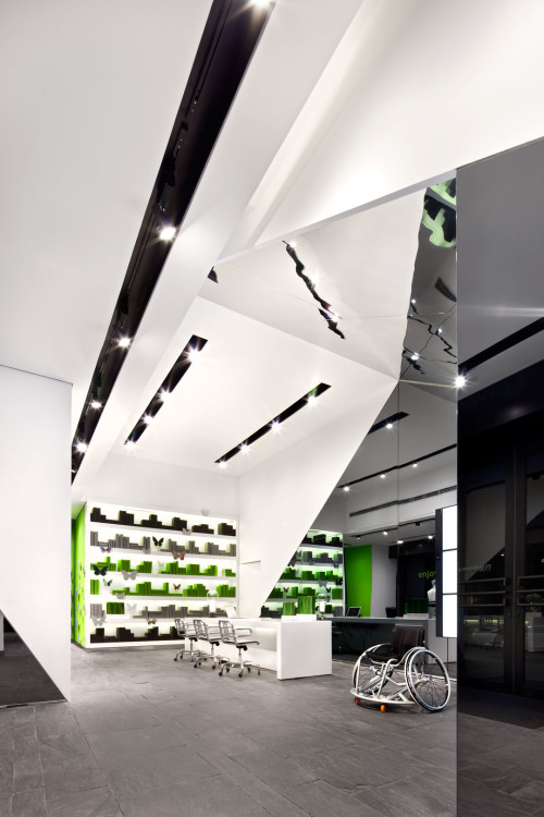
Tasked by Otto Bock, world leaders in state‑of-the-art orthotics, prosthetics and mobility devices, COO created a space to match the priorities of Otto Bock, focusing on customer service with convenience and support.
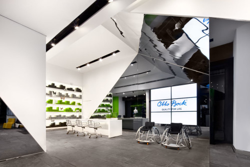
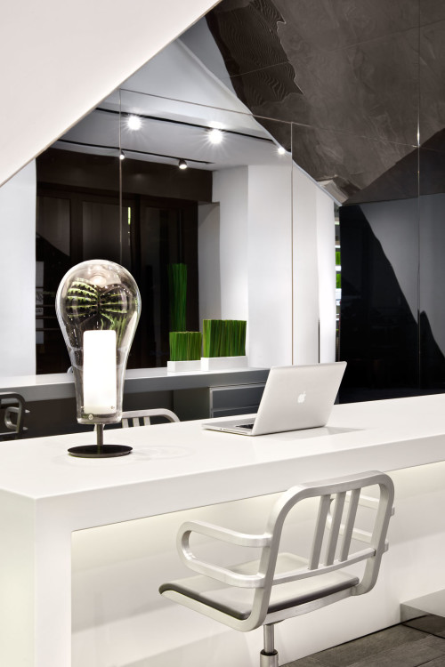
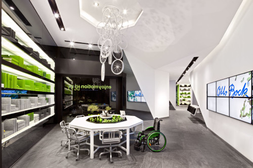
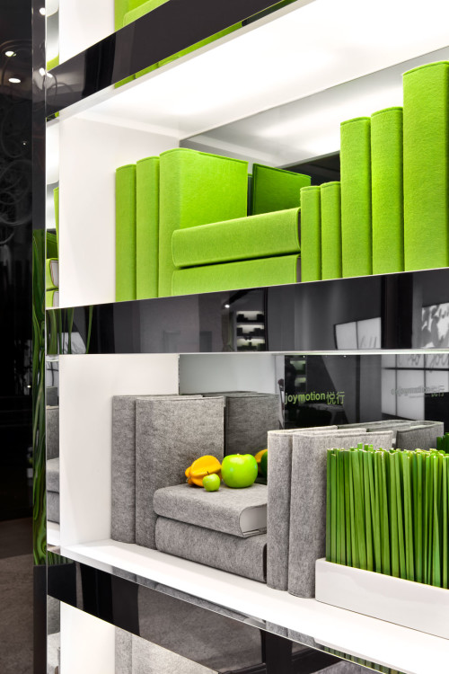
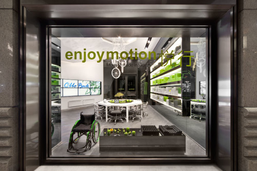
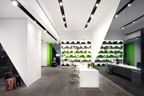
Featuring two entrances for optimum accessibility, visitors are greeted by either a wheelchair level reception desk, or large octagonal table, complete with movable seating allowing for chairs of any size, as well as accompanying family members. Creating ample room for wheelchairs to easily manoeuvre was crucial. At the same time, a low-level vertical display of therapeutic cushions is practical, and for the more mobile, positioned so that customers can test various options by leaning into the padded supports.
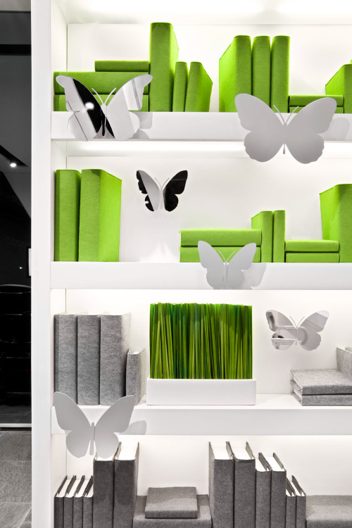
The store makes effective use of technology, reinforcing a defining quality of Otto Bock: kitted out with tablets, customers can explore products either alone or with the assistance of expert staff. An array of screens throughout present films as inspirational as they are educational, all off-set by an abstract take on classical bookshelves to balance the overall effect and cater to a diverse clientele.
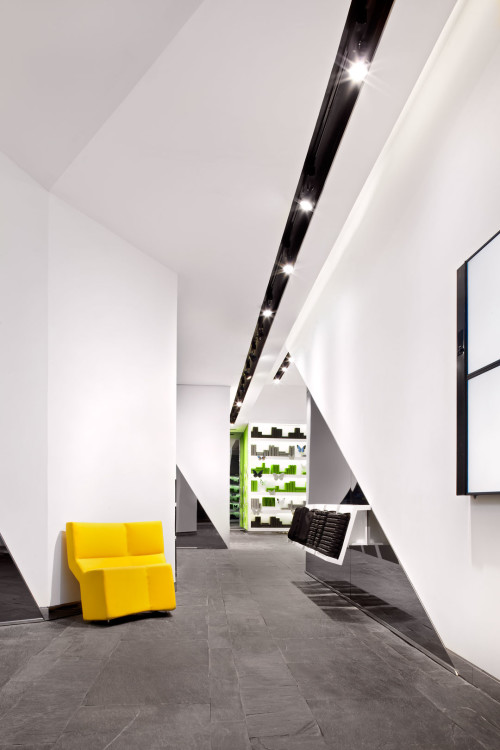
The 153 m2 space cleverly gives the illusion of infinite space thanks to effective use of angled mirrors. Visually striking, they have a practical purpose too: as with any lifestyle essential, COO expects the design is to facilitate decisions of both physical needs and, importantly, personal style.
Smashing the stereotype that mobility aids are for a defined demographic, Otto Bock create products for all ages. Accordingly, the store features several ‘islands’ showcasing the brand’s beautiful children’s furniture, designed to support infants’ growth, as well as practical push chairs and strollers. A separate area is dedicated to the brand’s sporting products complete with golf putting practice area.
Tasteful and contemporary, the store combines bright white and vibrant green against the classic, grey slate paving to striking effect. A butterfly motif, both digital and in reflective glass, is referenced throughout the space: playful and fun, the creature encapsulates agility, grace and energy — all qualities of the Otto Bock brand. Similarly, a stunning chandelier made from chair wheels underlines the strong design element of the products in a suitably innovative fashion.
The design demonstrates an understanding and affinity with Otto Bock. Through accessibility, design excellence and customer service, the store set a significant and altogether new precedent for the promotion of mobility aids in China.
Type:
Retail
Location:
202 Hubin Road, Huangpu District, Shanghai, China
Assignments:
Brand Consulting
Concept design
Detail design
Construction Supervision
Extent:
153 m2
Year of Completion:
2010
Team:
Tilman Thürmer
Vega Li
Yu Yin
Client:
Otto Bock Health Care GmbH
Photos:
diephotodesigner.de
